

The BBC and the national debt
The BBC and the national debt
Of all the things to criticise the BBC for, a review on impartiality picks the strangest

You’re won’t get much push-back from me if you say that the BBC’s coverage of economic issues could be better. Look at the state of this graph shown on BBC News at the time of the mini-budget, for example.
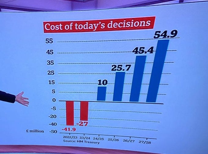
What the hell is going on with the vertical axis?
Michael Blastland and Andrew Dilnot recently published a review of the BBC’s economics coverage titled Review of the impartiality of BBC coverage of taxation, public spending, government borrowing and debt. It is a lesson in how to write an independent review: short, punchy and clear. A normal person could actually read it.
There is much in it with which I agree, particularly the criticism of the BBC’s knee-jerk tendency to demand that the government do more and spend more, but it is surprisingly light on examples of bias/incompetence. It could do with more case studies.
However, it does start with one example of alleged bias that the authors keep coming back to. They must think it is a strong case study. I don’t think it is.
This graph showing the national debt, taken directly from the Office for National Statistics, really seems to grind the authors’ gears.
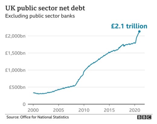
They make one fair criticism of this graph which is that the figures are not adjusted for inflation. The ONS has an irritating aversion to showing figures in real terms. It seems fairer to criticise the ONS, rather than the BBC, for this, but it is true that if you adjust for inflation, the national debt has not risen sixfold since 2000. It has ‘only’ quadrupled.
The authors spend several pages complaining about how misleading this graph supposedly is. Apparently, it is ‘alarming’ and an ‘impartiality hazard light’. It could even encourage - heaven forfend! - ‘anti-debt sentiment’.
The chart seems to show a huge and almost relentless rise in debt. At the top is a number in bold: £2.1 trillion. All this is presumably big and bad. At least, we think that’s what we’re meant to think.
And yet it is just a graph. How do the authors know what the BBC wants us to think?
Blastland and Dilnot say it would be better to show debt as a % of GDP. Fair enough. The ONS gives us that too and it uses a timeframe which is favourable to those who have a pro-debt sentiment because it includes two world wars. It remains the case that the debt is the highest it has been for 60 years and, unlike after World War II, it is not going down.
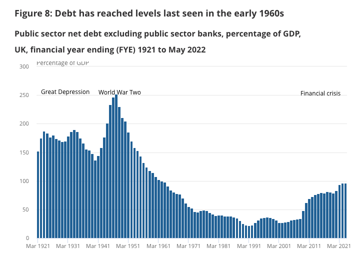
Regardless of how you measure it, the national debt has gone up to its highest level in many decades, as the authors concede. But, they say…
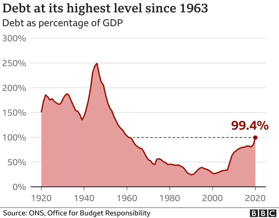
Did it go through the roof? Depends where you think the roof is. This too is fiercely contested by economists. As a % of national income, debt stands at about 100%. After the end of the Second World War it reached 250%. That is, different historical frames give a different sense of ‘high’ and ‘low’.
Who’s saying it’s gone through the roof? Unless the BBC uses that terminology, this is a straw man.
Perhaps alarm about debt is justified because ‘equal to 100% of income’ is nevertheless bad. Then how about 260%? That’s about the position in Japan now. How about 450%? That’s what many of us could borrow from a bank or building society for a house. But if you think 450% is worth it for you, why is 100% for the nation bad? There are plausible answers to that, but are the arguments heard?
There are some very plausible answers to that, such as the fact that people who take out a mortgage have a plan on how to pay the money back and will own a house outright by the time they’ve finished. The government, by contrast, mostly borrows to pay for day to day expenditure, has no real idea how it’s going to pay the money back and hasn’t balanced for books in over 20 years. If we’re going to use an analogy with a household - something the authors caution against a few pages later - the government is more like a person living day to day off the back of an ever-growing credit card bill.
Blastland and Dilnot then run through a whole bunch of pro-borrowing arguments, but don’t expand on any of the arguments made by fiscal conservatives. Remarkably, they don’t even mention the mini-budget when the fantasies of the fiscally incontinent came crashing up against reality. They claim not to have a view themselves, only that we should hear more from people who think the national debt is fine and the government should borrow even more money.
What is the evidence that such views are not heard on the BBC? So far, the authors have only been shouting at a graph. I have heard pro-borrowing, anti-austerity arguments on the BBC many, many times over the years and such arguments are implicit in a large share of its current affairs output.
To us, this chart implies a view: ‘it’s bad’ – maybe without anyone realising this is contested, perhaps in the belief a big, bad angle is better, i.e. ‘It’s bad, and right now it’s really bad... great story!’ If we wanted to present the data in the most alarming way we could, we might start with something like this chart.
That’s not impartial, no more than it would be impartial if the BBC said the debt was nothing to worry about.
They’re reading a lot into one graph, aren’t they? In truth, the opposite of the BBC saying ‘the debt is nothing to worry about’ would be the BBC saying ‘everybody should panic about the debt’. But they’re not doing that, are they? They’re showing a graph that could certainly benefit from being inflation-adjusted but which shows the figures in a way that most people can understand (% of GDP being a less easy measure to get to grips with). And whichever way you slice it, the national debt is at its highest level in at least sixty years.
It is not clear what the authors want the BBC to do. Do they want the offending graph dropped in favour of a graph showing debt as a % of GDP that includes the figures from two world wars, a graph that is at least as ‘biased’ towards the neo-Keynesians as the other graph is ‘biased’ towards fiscal hawks? Or do they want BBC articles which feature such graphs to include extensive discussion of the economic arguments for and against public borrowing plus some quotes from upper-normies saying ‘a nation is not a household’?
Surely what matters is the context in which this graph was shown. The authors don’t say which news story it came from but using a reverse image search I found it on two articles previewing the Budget in February 2021 and then again in a story from September 2021 headlined ‘Government borrowing higher than expected in August’.
The first of the pre-Budget articles is mainly about a ‘£5bn scheme for High Street shops and hospitality firms’. The graph appears alongside a graph showing unemployment. The BBC says…
The government has so far borrowed £271bn this financial year - up £222bn on 2019-20. This has pushed the national debt to £2.13 trillion.
This is a statement of fact. There is nothing about the national debt “going through the roof” or anything like that. Instead, the BBC quotes somebody saying exactly the kind of thing Blastland and Dilnot seem to like:
Martin Beck, senior economic adviser to the Item Club, said: “Despite an almost unprecedented peacetime deficit, serious action to repair the public finances can wait. The chancellor’s focus should still be on supporting the economy through the pandemic and premature fiscal tightening could undermine recovery.
“With the cost of government debt still historically low, there is no evidence yet of any significant constraint on government borrowing.”
The second article shows the graph Blastland and Dilnot don’t like, but only after showing the graph they do like. Surely they approve of this kind of balance?
The BBC correctly reports that borrowing for the year had “reached £270.6bn, which is £222bn more than a year ago” and quotes the following year’s projection from the OBR. It then gives the kind of historical context that Blastland and Dilnot approve of...
But it is also worth pointing out that this figure has been above 100% of Gross Domestic Product (GDP) or annual national income in 131 of the last 320 years.
The third article says that government borrowing was higher in August 2021 than expected but lower than in August 2020. It acknowledges that inflation has led to interest payments on the debt rising sharply, but there are no quotes from fiscal conservatives saying “I told you so”. Instead, there is someone from the IFS saying that it is crucial that “the large income tax, corporation tax, and National Insurance tax rises announced since March are actually implemented as planned” and someone from Capital Economics saying “the government’s financial position isn’t as bad as the Office for Budget Responsibility predicted back in March”.
I struggled to find any pro-austerity bias in any of these articles, but perhaps I do not have the sensitive antennae for subliminal messaging that Blastland and Dilnot are blessed with.
Are we making too much of one chart? Or does the lack of understanding here go wider – contributing to an anti-debt stance generally? We think the latter.
I think it’s definitely the former.
That said, the household analogy does not hold, since unlike a monetarily sovereign government, a household cannot print its own money.